


Case Study: Elevating a Premium Drinks Brand Through Innovative Label Design
Schades Group, 19 March 2026
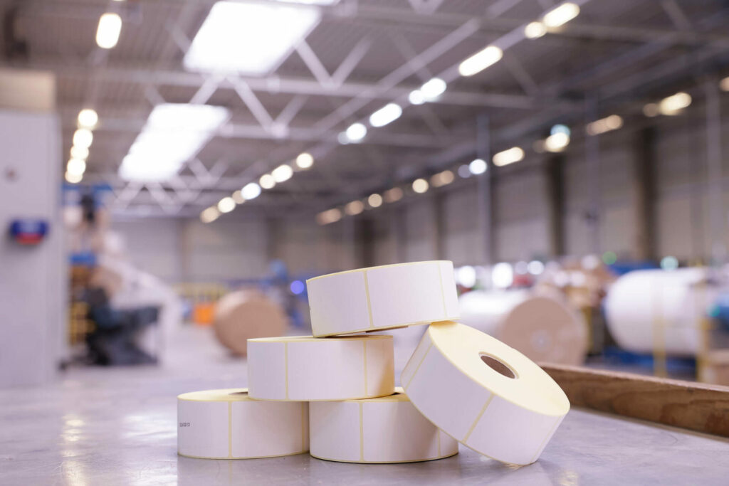
At Schades Group, we have experience designing and supplying labels to some of Europe’s biggest retail and hospitality businesses.
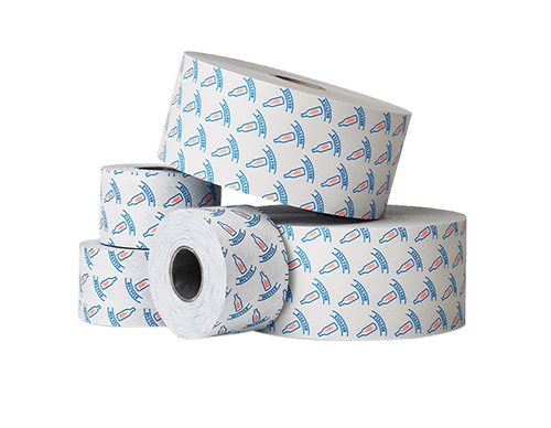
Hamilton-Schades Labels is known for producing branded and technical label solutions, including full design services. It has worked with brands across the UK and Europe for almost 35 years, including some of the largest household names.
Hamilton-Schades worked with Marlish, a significant disruptor in the premium bottled water and mixers brand based in the north of England, to rebrand and redesign its range of tonic waters and mixers.
Read this case study to discover how we helped to reposition the brand with a more contemporary look that reflects its position as an emerging force in the premium drinks market, whilst incorporating its farm heritage.
Working with a premium drinks producer
Based on a family farm in Northumberland, Marlish is a privately owned drinks producer sourcing its Spring Water from a natural aquifer beneath the estate. Founded by cousins Elizabeth Walton and Joe Evans, the business began with premium bottled spring water and has since expanded into tonic waters, mixers and flavoured spring water.
Now producing millions of bottles each year, Marlish has established itself as a key contender within the UK premium drinks sector, gaining increasing traction across pubs, restaurants and live event venues throughout the UK. Despite its growth, the business remains hands-on, with quality, provenance and integrity at its core.
Marlish initially approached Hamilton-Schades three years ago based on a recommendation from an industry contact. Over this time, we have produced high-quality labels for its range of premium glass-bottled water, supplied to trade customers.
A new vision for a growing brand
Having established a trusted partnership over the last three years, Marlish approached Hamilton-Schades with a clear ambition: to reposition its range of tonics and mixers with a more refined, contemporary look that better reflected both the brand’s farm heritage and its growing presence in the premium drinks sector.
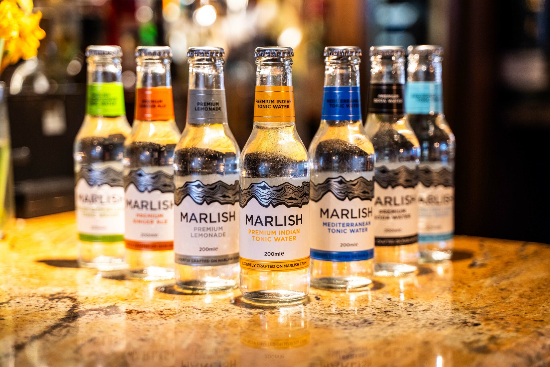
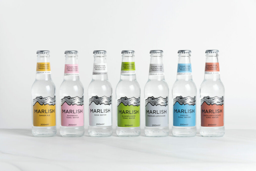
The existing tonic labels were produced on a silver filmic substrate. While effective, they lacked the warmth and character that the brand wanted to communicate. The new branding needed to focus on a more tactile, textured aesthetic that would stand out on the shelf while maintaining a premium feel.
The new design also needed to work across seven variants of tonics and mixers, with each requiring distinct colourways while preserving overall brand consistency and commercial viability.
Designing a premium label solution
Working to a tight deadline, we worked collaboratively with Marlish on the design concepts, exploring different paper options that would create a premium look whilst reflecting the brand’s heritage and maintaining commercial viability.
Our recommendation was to move away from the silver filmic substrate and adopt a textured paper stock – typically used within the wine & spirits industry – to create a more rustic feel aligned to the brand’s provenance and business history.
Alongside this, one of the central design features was a striking metallic silver element. Traditionally, achieving this level of reflectivity would require foil blocking – a process that can add significant tooling cost and material waste. Instead, we worked closely with specialist ink suppliers to implement an ultra-high lustre metallic ink. This innovative ink bridges the gap between standard metallic inks and foil, delivering a highly reflective, premium finish without the expense or environmental impact associated with traditional foiling.
To enhance the sensory experience, the team developed a layered finishing approach. This included a matte varnish to provide a sophisticated base, with gloss applied on top to amplify the reflective silver elements. A textured “rough touch” varnish on the upper section of the label introduced subtle contrast and tactility, creating a distinctive finish that feels modern whilst giving a nod to the company’s Northumberland roots.

Delivering a refined identity
The redesigned labels strengthen Marlish’s market positioning as a premium provider within the tonics and mixers drink category, while remaining commercially and environmentally conscious.
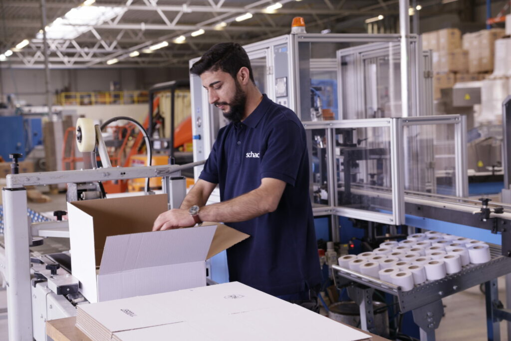
The first production runs across the tonic range have now been completed, with production ready to roll out across the whole flavour portfolio.
The finished result is a label solution that balances aesthetics with practicality – combining the heritage of the brand with innovative modern design techniques to define a truly premium product.
Joe Evans, Director of Marlish Water, said: “We have been highly impressed with the attention to detail and support Hamilton-Schades have shown our business since the relationship began. With all of our products being created and packaged at source on our production facility on Marlish Farm, we are meticulous about labelling perfection. Hamilton-Schades have invested a lot of time and effort to help us optimise visual brand appeal and production efficiency for which we are very grateful”.
Chris Green, Sales Director of Hamilton-Schades, commented: “Having worked closely with Marlish for several years, we understood how important it was to retain the integrity of the brand while elevating its premium appeal. By working with specialist ink suppliers and layering finishes carefully, we delivered a highly reflective, tactile label that reflects Marlish’s authentic heritage and catches the customer’s eye on the shelf.”
This case study shows how we work with our clients to provide bespoke solutions tailored to their requirements, with the capability to deliver complete rebrand and redesign label solutions that work commercially and aesthetically in the UK.
To find out more about our work in the retail sector, visit: https://schades.com/sectors/retail/.
